Analogous Colors In Photography: Master Harmonious Shots
December 20, 2024

Whether you are capturing serene landscapes or intimate portraits, understanding how to use analogous colors can transform your images into works of art.
Photography is a graphic art that uses purposeful hue to elicit certain emotions, create a focal point, and unify an image’s visual narrative. Among the many techniques used to compose striking snaps, analogous colors are guaranteed to produce visually appealing photographs. In this guide, we will explore the fundamentals of analogous colors definition, the workings of the related shade wheel, and how to apply harmonious tone theory to elevate your photography.
What Are Analogous Colors?
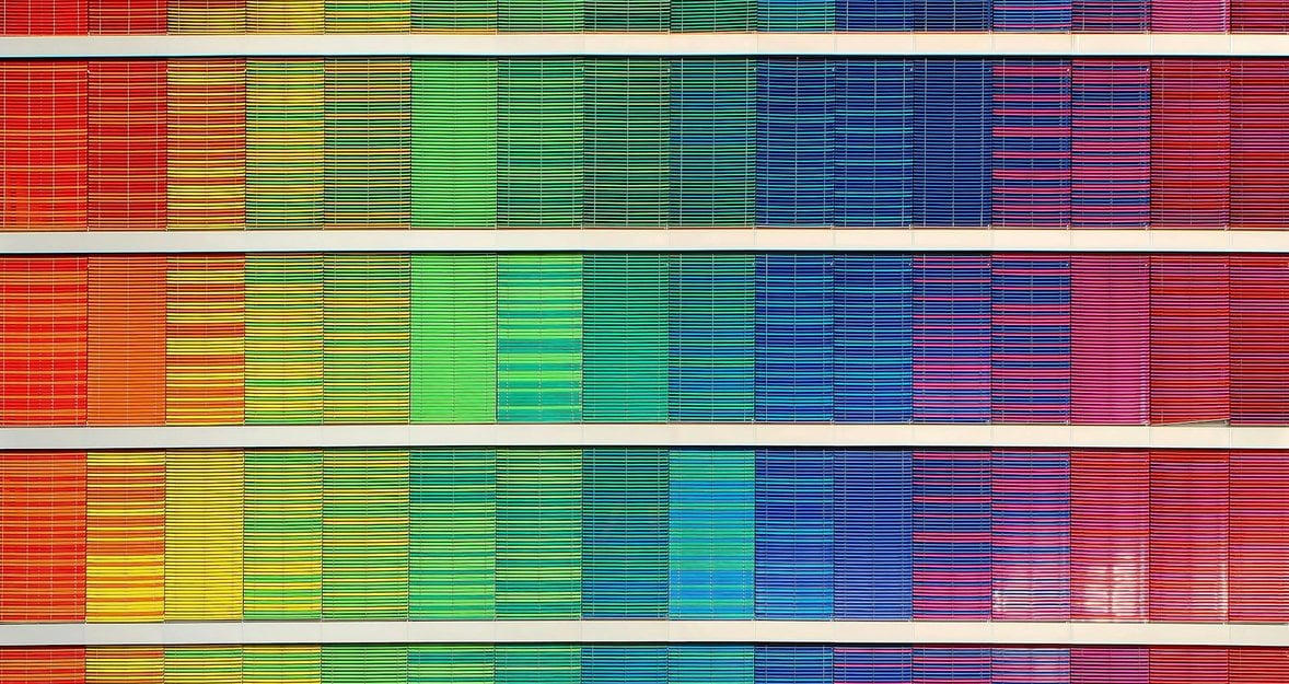
 The concept of analogous colors is rooted in the arrangement of hues on the coloring wheel. Simply put, they are groups of three to five colors that sit adjacent to each other on the wheel. For example, red, orange, and yellow are analogous, as are blue, teal, and green.
Because of this sharing of the analogous color wheel, spanning from one side to the other, the combination of hues flows naturally and smoothly with a soothing, calming effect. In contrast to opposite pigments, which can be dynamic or extreme, homologous tone harmony is best suited for producing gentle atmospheres. That’s why it is often used in photographic styles as:
- Landscape photography. To record the flow states of natural scenes such as sunsets or wooded areas.
- Portraits. Where contrasting tints on the skins and backgrounds may yield an aesthetically gentle and attractive appearance.
- Still life photography. To emphasize balance and unity among subjects.
By choosing the right combinations, photographers can create cohesion and draw the viewer’s eye naturally through the frame. Tools like the change color in image feature help refine this harmony during post-processing, ensuring that the shades remain aligned with the artist’s intent.
Exploring the Analogous Color Wheel
 The analogous wheel is the photographer’s roadmap to hue relationships. It visually shows how the tone transitions from one to the next, making it easier to identify harmonious groupings.
Warm vs Cool Analogous Colors
Hues on the wheel are broadly categorized as either warm (reds, oranges, yellows) or cool (blues, greens, purples). Each set of analogous groupings conveys distinct moods:
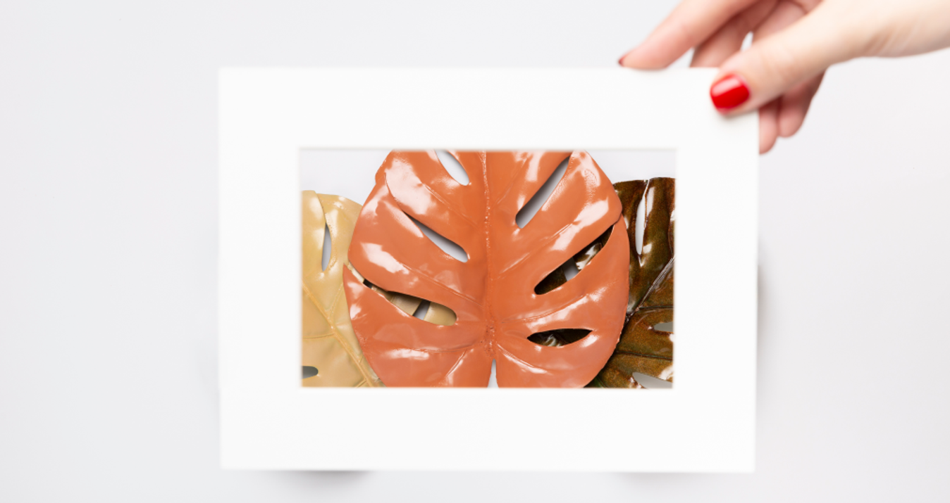
- Warm Tones. These evoke energy, optimism, and comfort. A fall scene, with golden leaves and an orange sky, is a textbook instance of a warm related palette.
- Cool Tones. These are associated with calmness, serenity, and introspection. A serene beach backdrop featuring blue and teal hues illustrates the aesthetic appeal of cool analogous on the wheel.
When planning a shoot, using the color wheel as a reference can help you predict how shades interact within the composition. If your picture lacks harmony, post-processing tools like the color replacement tool enable you to make precise adjustments that align with analogous color theory.
Analogous Colors in Action
 Using a similar shade harmony runs to both pre-shoot planning and post-production refinement. Follow the suggestions below for using these palettes effectively in photo shoots.
Plan Your Color Scheme
Choose the main color and supporting hues of your image before shooting. For instance:
A forest photo may prioritize green as the main tone, with yellow and teal as accents.
A portrait session could feature red color outfits with subtle orange and pink highlights in the background.
Focus on Lighting
Lighting plays a determinant role because it allows for the gradual shift from one tone to another subtly. This effect is further improved by using natural light, particularly the golden hour or cloudy conditions. Strategically placed artificial light can also be used to emphasize specific highlights and achieve depth and dimension to the composition.
Use Natural Context
Nature is replete with endless possibilities to use analogous color harmony. Think of the gradient in a sunset or the gentle variation in flower petals. Accentuate these transitions by framing your shot to emphasize the flow of hues. If your shot feels disconnected, tools like image color transfer may be used during editing to harmonize your shade scheme.
Post-Processing for Color Harmony
 Even with careful planning, real-world conditions often require post-production adjustments to achieve the desired aesthetic. Here’s how to refine your shots for perfect analogous colors on the color wheel.
Color Grading
Color grading meaning involves the process of changing the overall shading dynamic of an image to produce mood and visual unity. This approach can be used by applying a similar hue scheme, which will consequently help to highlight harmony and better channel the natural progress of the spectrum across the frame.
Replace Clashing Tones
Sometimes, some photos’ colors may not align with your intended palette. Shade replacement tools can be powerful for correcting these mismatches, ensuring the final image feels cohesive.
Fine-Tune with Selective Adjustments
Tools that change pigment in a shot let you isolate specific areas for precise tone corrections, leaving other sections untouched. This degree of control enables you, for example, to further enrich your palette’s harmony while maintaining the natural balance of the whole image.
Analogous Color Theory in Portrait Photography
 Portraits constitute one of the most effective channels to convey similar shade descriptors. Always in the background, the surrounding elements accumulate, gradually affecting the atmosphere.
Tips for Portraits
- Wardrobe and Setting Coordination. Ensure the subject’s clothing tones match the environment. For instance, blues and greens are suited for shoots in the open air in the park.
- Skin Tone Adjustments. By applying color transfer, you can associate skin tones with the environment shade palette for natural and vivid portraits.
- Add Contrast. Add texture or subliminal convergent details (like jewelry and makeup) so as not to become monotonous but within the analogous wheel.
Balancing Analogous Colors with Neutral Tones
 While neighboring colors create harmony, incorporating neutral tones like white, black, gray, or beige would balance the composition and prevent it from becoming overwhelming. Neutrals function as a visual “breathing room” in which the chromatic values can stand out conspicuously without overloading the entire picture.
For example, in the case of blue and green shadows, filling the background with neutral colors or soft gray garments may ground the picture and focus the viewer’s attention on the sitter's face. In the same way, a cloudy sky or neutral background can add a subtle contrast to a typically highly chromatic scene. Consider using neutrals as buffers in your shots to add depth and sophistication to your analogous color palette.
Common Challenges with Analogous Colors
 Even though analog color harmony is relatively straightforward, it has difficulties. Here are some pitfalls to watch out for:
- Flat or Monochromatic Look. If there are too many congruent pitches, the image will look artificial. Introduce soft variety in texture or light for interest.
- Overloading Colors. There is a risk of diminishing effects if too many hues are used in the palette. Keep it simple using less than or equal to three or five similar schemes on the shade wheel.
- Excessive Editing. Overuse of post-processing tools can create artificial-looking photographs.
By preventing such errors, photographers will preserve their images’ artistic and emotional quality.
Wrap-Up
Employing analogous colors in photography is not simply for visual appeal but may also be a means to tell stories, evoke feelings, and ensure a visual flow in pictures. Whether photographing serene landscapes, heartfelt portraits, or thoughtfully arranged still-life compositions, working with harmonious hue combinations can elevate your work to a new level.
Planning from the start to the final touches in the editing and mastering stages simplifies the task of creating aligned and aesthetically pleasing photos. If you use these techniques, you will transform your shots into moving works of art that express feeling and aesthetics.


