Colorful Portrait Photography: Illuminate Your Story
July 01, 2025
Discover how to use color in portrait photography to create emotion, depth, and storytelling. Learn color theory basics, practical tips, and editing tricks to take your portraits to the next level.
Ever notice how some portraits just feel a certain way, even before you look at the expression or composition? A lot of that comes down to color. The tones you choose (and how you combine them) shape how people connect with your images.
In this guide, we’ll explore how color works in portraits, from basic principles to emotional impact, and offer a few tips for editing portraits that help bring it all together.
If you’ve ever wondered how to choose the best colors for your portrait photography, or just want to bring more intention to your work, you’re in the right place. Let’s dig in.
The Color Wheel: Your Behind-the-Scenes Creative Tool
 The color wheel might sound like something from art class, but trust me—it’s one of the most useful tools in portrait photography. Once you get the hang of it, you’ll start making color choices that feel right, instead of just guessing.
Let’s break it down:
Primary, Secondary, and Tertiary Colors
It all starts with three primaries: red, blue, and yellow. Mix those, and you get the secondaries—orange, green, and purple. Then there are the in-betweens (tertiary colors) like red-orange or blue-green, perfect for adding subtle complexity to your palette.
Discover the Power of AI in Portrait Editing
DIVE IN NOW!Now, the real fun begins with color schemes. These are ways to group colors that naturally work well together.
Color Schemes
Monochromatic: Just one color, but in different shades and tones. Think soft beige-on-beige or bold variations of blue. Clean, minimal, and super cohesive.
Complementary: Colors opposite each other on the wheel—like blue and orange. They have the strongest contrast, so they pop. Great for making your subject really stand out.
Analogous: These colors sit next to each other—like green, teal, and blue. They blend beautifully and feel natural. Easy on the eyes, great for gentle mood shots.
Split Complementary: A main color plus the two neighbors of its opposite. Slightly more playful, a little less intense than pure complementary. Balanced, but with a twist.
Triadic: Three colors spaced evenly around the wheel—like red, yellow, and blue. Bold, energetic, and tricky to balance, but eye-catching when done right.
Tetradic: Two complementary pairs. It’s the most complex setup—lots of color, lots of contrast, but also the most room to experiment with richness and depth.
Learning these gives you a toolkit. You don’t have to follow rules rigidly, but when you're building a color palette for a set, styling, or editing portraits, this helps you make decisions with confidence.
Learn more: 5 Tips for Dramatic Portrait Photography
Color and Emotion: What Your Palette Feels Like
 Even before someone notices the expression or composition, color sends a message. If you want your portraits to connect on a deeper level, it helps to know what each hue can quietly communicate.
Color | Emotional Feel | Use it for... |
Red | Bold, passionate, energetic | Creating focus, adding drama, evoking strong emotion |
Orange | Playful, warm, creative | Adding energy, friendliness, or a spark of fun |
Yellow | Cheerful, bright, optimistic | Lightening the mood, conveying joy and warmth |
Green | Calm, balanced, natural | Outdoor portraits, peaceful or grounding scenes |
Blue | Trustworthy, tranquil, sometimes melancholic | Adding emotional depth, cool tones, calm vibes |
Pink | Soft, nostalgic, affectionate | Romantic, gentle, or dreamy portraits |
Purple | Mysterious, elegant, spiritual | Adding richness, ambition, or a touch of drama |
Brown | Earthy, stable, dependable | Natural backdrops, honest or rugged mood |
Black | Sophisticated, powerful, dramatic | High contrast, bold statements, or a polished look |
White | Clean, fresh, minimal | Simplicity, purity, openness—gives space to other elements |
Colors are not just seen—they’re felt. Let’s make your next portrait session an interesting journey by painting with light and emotions!
Principles of Color Portrait Photography
 Color doesn’t just fill space—it shapes the shot. The right color choices can turn a simple portrait into something that feels layered, intentional, and alive. Here are a few practical ways to start using color with more confidence:
1. Color-on-Color
 Layering similar shades in one frame? Totally underrated. Try a dusty pink sweater against a bold magenta wall or a blue-on-blue combo—it creates subtle depth that draws the eye without shouting. This kind of tone-on-tone play adds mood without getting busy. Bonus tip: Some editing tools (like color transfer in Luminar Neo) can help you match tones from a reference photo. It's great if you’re building a consistent series.
Exclusive Tools of Endless Possibilities in One AI Editor
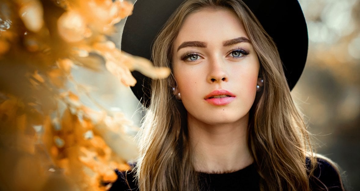
Explore Now!2. Black or Gray Backdrops
 Want to make your subject's colors explode off the image? Use gray or black backgrounds then. These neutrals are perfect for making any hue the subject wears stand out. Think of them as the dark sky bringing out the brilliance of the stars. It's a backdrop and a stage that lets your colors shine.
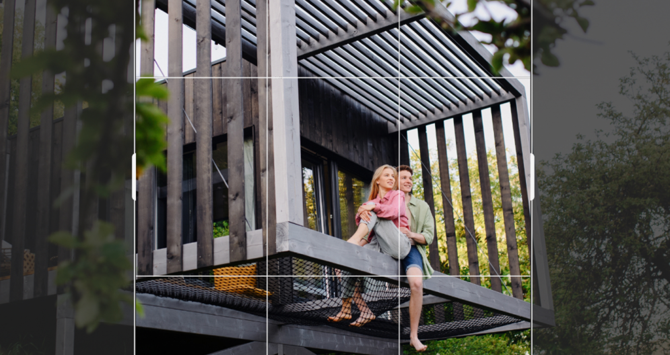
3. Opposites = Energy
 Complementary colors (like orange and blue or red and green) bring contrast and punch. Use them when you want visual tension or to make your subject really stand out from the background. It’s a classic trick for a reason—it works.
Learn more: 50mm vs 85mm: which one to choose for portrait photography?
4. Red Means Focus
 There’s a reason red is the color of stop signs and fire engines—it demands to be noticed. Using reds in your portraits grabs attention and directs it exactly where you want it. Reds have the power to elevate a photograph from ordinary to mesmerizing!
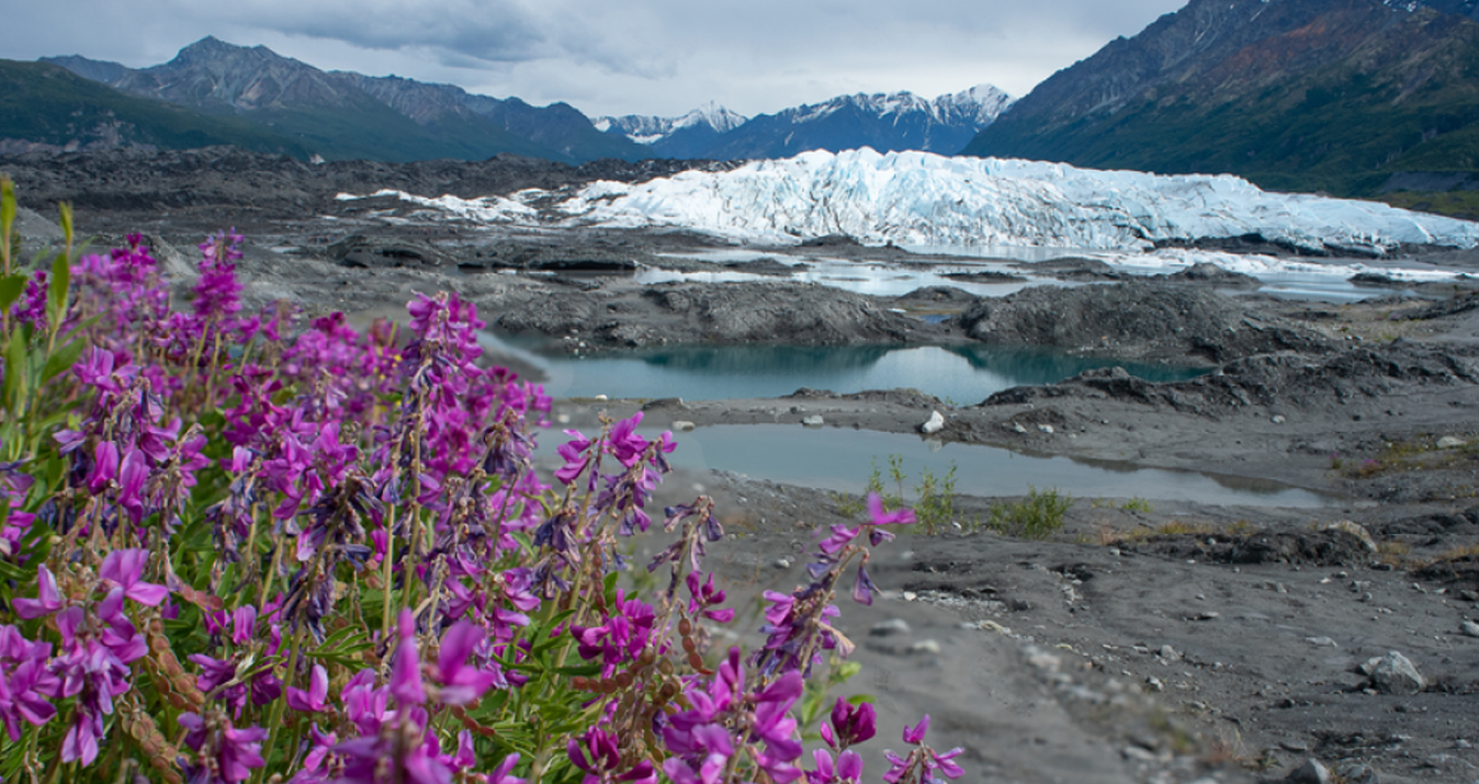
5. Let Nature Help
 Natural outdoor colors can give your portraits an authentic and vibrant look. The light changes during the day, therefore, you can get a variety of hues and intensities. The soft greens of a park or the pastel hues of a city at sunrise are a natural palette you can never replicate with studio lights (but what is interesting is that you can work the other way around and recreate studio light photos in Luminar Neo).
6. The Secret Power of Neutrals
 Neutral tones might seem safe or dull, but when you use them creatively, it can subtly highlight the vibrant colors in your shot. A beige environment can make your subject's bright clothing or a vivid prop pop, which creates a focal point without overwhelming the scene. Neutrals are like quiet friends who bring out the best in everyone without taking the spotlight.
Conclusion
 Today, we’ve discussed the principles of using colors and how they can transform your portrait photography, so at this point, you're ready to add more depth and hues to your photographs!
Remember, color is not just about beauty; if you apply it correctly, it can be a powerful tool for evoking emotions and telling stories.